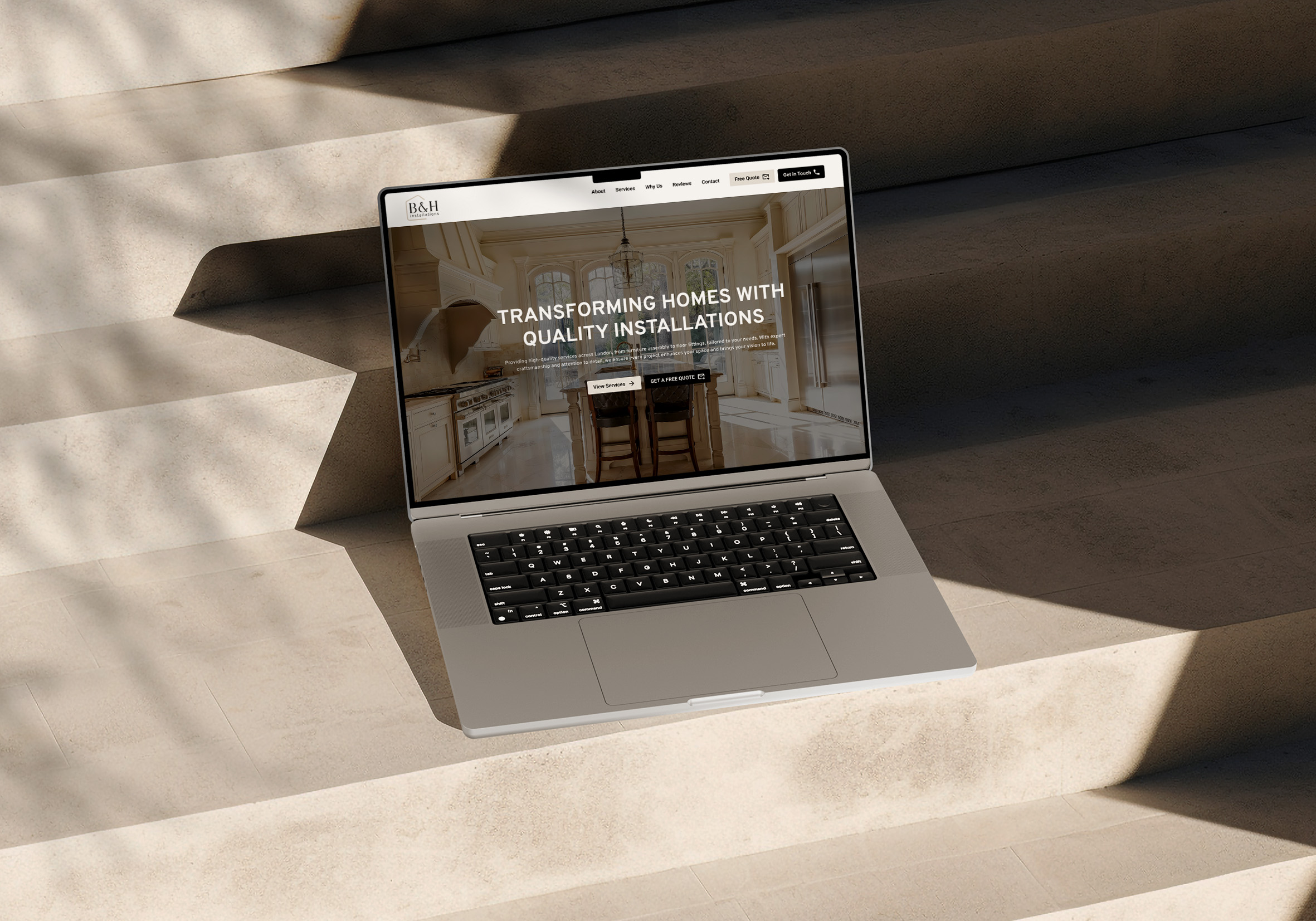
Most people decide within a few seconds whether to stay on your website or go back to Google. In that time they haven't read your About page or looked through your services. They've seen your homepage, and that's what they're judging you on.
That's why a homepage isn't just there to look nice. Its job is to help someone make a decision. When it's laid out well, a visitor knows what you do, whether it's for them and what to do next without having to think about it. When it isn't, they leave, usually without you ever knowing they were there.
When someone lands on your homepage, they're quietly asking five things:
If your homepage doesn't answer these quickly and clearly, people won't go digging for the answers. They'll click the next result. Here's how to answer each one.
Your headline is the first thing people read, so it needs to say what you do and who it's for. Clever wordplay and vague slogans can sound good when you're writing them, but if a visitor has to decode them, you've already lost them.
"Helping you reach new heights" could be anything. "Roof repairs and replacements for homeowners" tells someone straight away whether they're in the right place. A short line underneath can add detail, but the headline should make sense on its own.
People want to feel they're in the right place. Make it obvious who you help, whether that's homeowners, growing businesses, new parents or other trades.
Images do a lot of work here. Photos of the kind of people, places or projects you work with say "this is for you" faster than a paragraph ever could.
This is where a lot of homepages slip into listing features. Features describe what you offer. Benefits describe what changes for the customer.
"Same-day quotes" means more than "we offer quotes". "Book online in under a minute" means more than "online booking available". Go through each point on your homepage and ask yourself what it actually means for the person reading it.
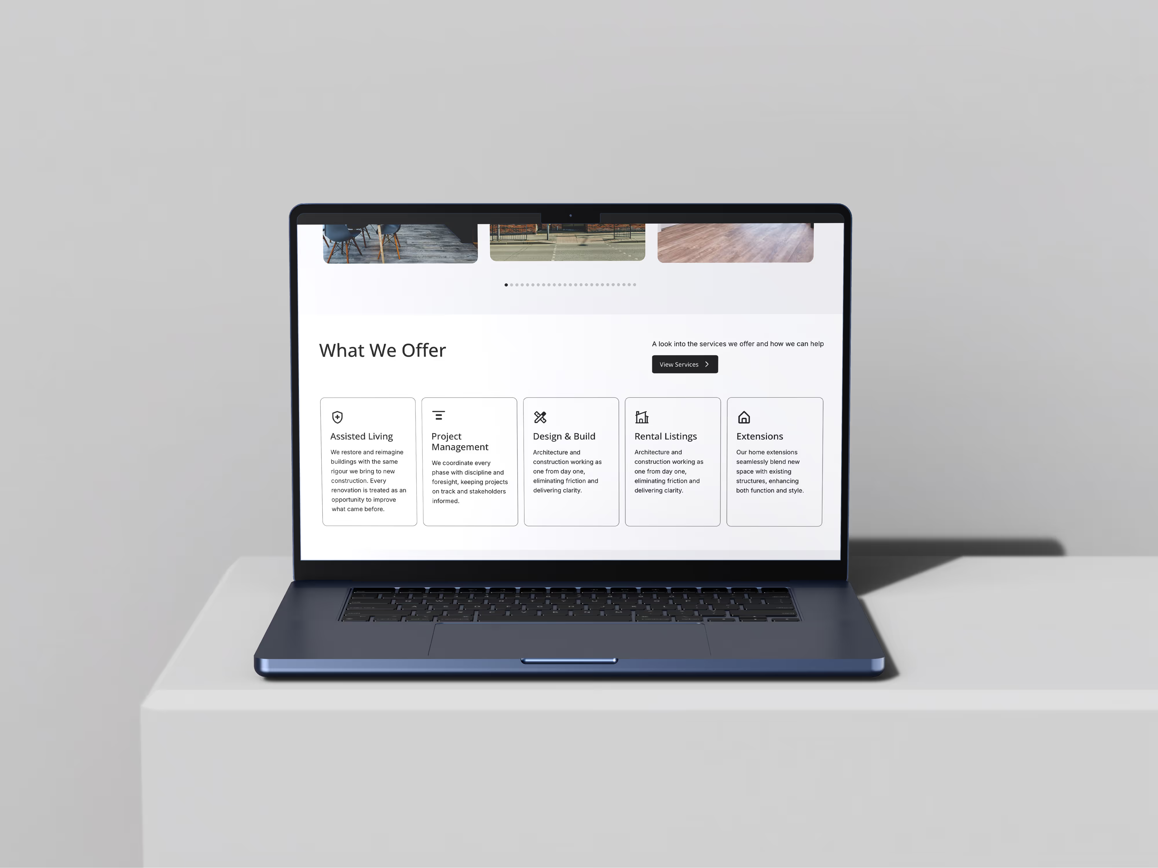
Once someone knows what you do, they need a reason to believe you'll do it well. Reviews, results, client logos and real examples of your work all build that trust.
Keep your proof near the top rather than tucked away at the bottom. A couple of strong reviews close to your headline do more than twenty at the end of the page that nobody scrolls down to. Real photos of your work or your team will always beat stock images.
Every homepage needs one obvious next step. That might be booking a call, getting a quote or viewing your packages. Pick the one that matters most, make it your main button and repeat it as people scroll.
When five different buttons are competing for attention, people often click none of them.
The five questions also give you a simple order to follow:
You can add more sections, such as your services, FAQs or a short introduction to your team. Every section should still help answer one of the five questions. If it doesn't, it's probably getting in the way.
A confused visitor doesn't buy. A clear homepage turns "I'm just looking" into "I know what I need to do next".
To check yours, read your homepage as if you were a new customer seeing it for the first time. If you can't answer all five questions within a few seconds, your visitors can't either. If the problems go further than the homepage, our guide to signs your website needs a redesign covers what to look out for.
A clear headline that says what you do and who it's for, the main benefits of working with you, proof such as reviews and examples of your work, and one obvious next step. Everything beyond that is optional.
Long enough to answer the five questions, and no longer. Most effective homepages have between five and eight sections. If people need more detail, link them to your services or About page rather than fitting everything onto one page.
The hero section at the top. It's the first thing visitors see, and it decides whether they scroll or leave. Your headline and main button need to work without anything else around them.
One main call to action, repeated through the page. You can include a secondary option, such as viewing your work, but it should be clearly less prominent.
If the rest of your site works well, improving the homepage on its own can make a real difference. If your site is slow, dated or hard to update, a full redesign usually makes more sense.
At Chapter Two Studios, we build websites that make the decision easy for your customers. If you'd like a fresh pair of eyes on your homepage, book a free call and we'll talk it through.

Ready to enhance your digital presence, get more clients and build a brand that feels clear, confident, and built to support your next stage of growth? Get in touch today!